Wednesday, May 15, 2013

Sample No 4 for Edwardian Lady and Natures Notes


This is my 4th sample and 2nd from the August section of Edwardian Lady.


I love the colour combination of pink and yellow, perfect for that late summer months.
I selected a piece of 12 x 12 Core’dinations yellow paper from the Roy G Biv stack and passed it through my Embosellicios Regency Damask 8 x 8 folder. Lightly sanded with my Core’dinations sanding block to highlight the pale core of the card.

Selected the yellow and white lattice print paper from the August section of Edwardian Lady. Matted this section onto white card and then onto pale blue card.


Punched a Dragonfly element, cut out a small blue tag and blue leaf and added a sentiment from the cd.
From the www I sourced a free down loadable image and cut out, coloured with water colour paints and inked the edges with distress inks to make the paper look old. Once ink was dry I spritsed with water and crumpled and left to dry.

Made a small envelope from craft paper.

Selected a gorgeous delicate piece of ribbon lace and threaded some pale blue checked ribbon through. 

Tied this round the yellow lattice, white and blue matt and layer stack.


Played around with the layout until I was happy. Added an organza blue ribbon bow and some shop bought yellow roses and a blue pearl brad. The base of the card was made from Centura Pearl Snow White card.

Remember and tune into Create and Craft TV at 8 am on Monday 20th May 2013.


Sneak Peak Number 3 for Edwardian Ladies Four Day Deal on Create and Craft TV


The 3rd of my cards for next week’s launch on Create and Craft TV from Crafters Companion.


Using the Edwardian Lady I chose the gorgeous colours in the August section. I loved the image of the foxglove on the August shaped card but didn’t want to use it as it was. So I printed and cut out the main Foxglove oval. I used my embossing pen and added clear embossing powder to some of the blooms to make them look as though they are glistening with dew (or more like rain).
The green and pink swirl paper is a perfect background for the Foxgloves to nestle against, but I aged the edges with Victorian Velvet to tie the pink and green together. Then matted and layered onto some pink card.

I wrapped very loosely some narrow gold and cream ribbon twice round the pink and green matt and layer – I didn’t intend to leave it loose but the first wrap didn’t stick properly and I liked how it looked, so I think it’s what they call in the business ‘’a happy accident’’.

I cut the pink leaf flourish and pink button from the cd-rom and added clear embossing powder to create shine and dimension.

The tag was cut from the cd and the pink frame layered on top. Added some garden twine to the tag.
The love heart was a cheap silver embellishment I had in my stash, but added gold embossing powder and created a lovely gold expensive looking embellishment.

I covered a matchbox with craft paper, wrapped a section of garden twine around it twice. Lined the inside with some crumpled up white tissue paper to create a bed for the acetate butterfly. I used my alcohol pens to lightly colour the acetate butterfly and glued into place.  
All that was now left to do was to stick it all together using my Collall glue. As always I build the card never actually gluing any of my embellishments down until I am 100% happy with how the card looks. 

Once happy I take a picture on my mobile, deconstruct the card and use the picture to refer to rebuild the card. Nine times out of 10 am happy with the results.


Remember and tune into Create and Craft TV on Monday 20th May at 8 am…make sure you have set the alarm.

Edwardina Lady and Natures Notes sneeky preview No 2

This is the second of my sneak previews of the fabulous new launch from Crafter's Companion launching as a Four Day Deal on Create and Craft TV at 8 am on Monday 20th May 2013.


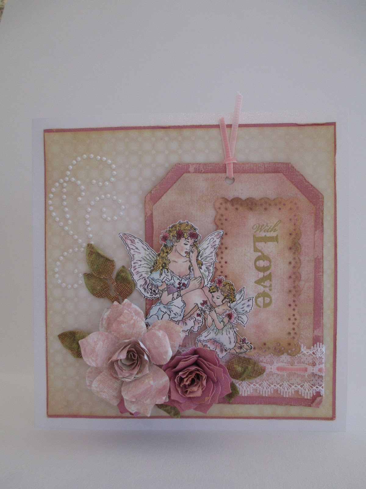
Havent done an album before but thought this cd collection so suited a Mini Garden Album – ideal for recording dates of planting seeds/seedlings, photographs of your garden in full bloom and would make a lovely gift.

I started with a very cheap and basic bare chipboard album kit (they tend to come with the covers, insert pages and the rings) and come in various designs. For my project I chose the square album.
I loved the papers and embellishments on the Edwardian Lady cd, especially the July section. I selected the papers and embellishments that I liked and used these as my anchor colour – dusky pink and ochre green.

I covered the album with a piece of Core’dination’s Tim Holts 12 x 12 paper and passed it through my cutting machine with the Crafter’s Companion 8 x 8 embossing folder Regency Damask. Sanded the relief pattern back with my Core’dination’s sanding tool to give a worn and distressed look. Cut the piece of card to size and stuck to the front of the cover with double sided tape. Ensure to leave enough of an overlap around the edge to fold over neatly and secure with some tape. Doesn’t need to be to perfect on the inside. Selected a piece of co-ordinating ribbon and cut to size, leaving enough to tie a nice bow. Attached to the inside of the cover with strong tape. Cut a piece of the same or co-ordinating card  for the inside of the cover and attach. Used my Tim Holts distress inks (Old Paper, Victorian Velvet, Walnut Stain and Antique Linen) to age the paper, building up the colour gradually. Darkened the edges of the cover by running one of my distress ink pads along the edges. Used my pokey tool to punch through the pre punched holes for the ring to go through later. Carried out the same procedure for the back cover or alternatively just cover in a co-ordinating paper; I used craft paper for mine.

I printed off the all the embellishments, toppers etc from the July section and set about cutting them out – I find it easier to cut and then play around with them to get the layout I like. The embellishments needed background frames for them to sit against. Used my pink chevron paper first as I loved the pink on green effect. Cut a section more or less the height of the album minus a few cm’s each end. Distressed edges with Victorian Velvet. From by crafty stash I had a piece of paper with a chicken wire pattern which I thought fitted well with the garden theme and cut a small square that was slightly wider than the pink chevron strip, so that it overlapped. Matted this onto a slightly larger piece of craft paper. Aged the edges again with Old Paper and Victorian Velvet. To give dimension I used 3d foam tape to layer the chicken wire layer onto the craft paper square.   From the ochre green damask paper I cut a largish rectangular section, layered onto piece of pink Core’dination paper from Roy G Biv that matched the pinks in the chevron paper and then onto another layer again slightly bigger out of craft paper. Distressed all three layers with Old Paper and Victorian Velvet. Now that all the background frames are ready I placed them on the album. I didn’t stick them on yet as I was still ‘playing’ with the layout.

Now for the embellishments. From the cd I printed and cut out with my craft knife 2 0 1 3 in a greenish colour. Used the colourising tool to get the colour I wanted. Once cut out inked with my Victorian Velvet. Found a place for them on the frame that I liked and placed them on (still not gluing them down).

For extra dimension and focal point I found on the www a free printable seed packet, have a look there are lots out there free to use. Printed it off, cut and coloured using by markers and distressed to make it look like it was made from craft paper. Wasn’t sure about passing craft paper through my printer as it’s quite a thin paper. I left my packet open as I liked the look but would be nice to closed and actually put seeds in the packet. Again I placed it where I liked the look of it.

You might wonder why I’m not sticking anything down yet…well I always end up changing my mind where things go so I spend ages playing with the layout. Once I’m happy I take a pic on my mobile, take it apart and use the pic to help me replace and stick. That way you hardly ever mess up your project.

Selected from the toppers and embellishments sections on the cd, elements that I liked and distressed the edges (which also helps get rid of the visible white core). Used the large pink button and tied a piece of garden twine through the button holes. The small pink tag was cut out, added a small beige pearl to the centre of the flower and attached a piece of knotted garden twine. Cut out the pink leaf. Selected a round punched element (I didn’t have a punch this size so cut carefully with my craft knife). I printed it twice as I cut the small viola flowers out with my craft knife and decoupage them on top of the round punched element with my silicon glue. I loved the round viola decoupage element against the green damask matt and layer. Cut another small viola frame from the cd and used this to the pink chevron and chicken wire matt and layers together.


I added additional embellishments from by stash with a small wooden bobbin. Used my Walnut stain to make dark brown; wanted to make it look more like an old fashioned garden twine bobbin rather than a sewing bobbin. Added some ultra sticky double sided tape of the red kind to the body of the bobbin and wrapped garden twine round it. Made a small cream rose (but a shop bought one would look just as nice) and added a small wooden peg.

To create dimension and height when adding your embellishments you can use silicon glue and foam pads and try tucking things under others. Don’t always feel you have to show all of the embellishment; sometimes it’s nice just to see part of it.

Once I was happy with the layout, I took a pic on my mobile and removed all the elements. Used my glues and tapes to re build the front of the frame. Remember when using silicon glue to allow plenty time for it to dry.


Once dry inserted the metal rings through the back cover of the album, then the insert sheets then the front cover. I tied two small sections of the same ribbon as I attached earlier, and that’s you done. I left the insert pages blank but why not decorate those also.

Keep popping in for more sneaky previews prior to the launch on the 20th May.

Sneak Preview of a brand new launch from Crafter's Companion


Edith Blackwell Holden’s collection of seasonal observations, poetry, and pictures of birds, plants, and insects—which was never even considered for publication when it was composed—had the nostalgic charm of a vanished world seven decades later. It became a world-wide best seller. This fabulous new launch from Crafter’s Companion encapsulates and brings to life Edith Holden’s gorgeous imagery for us all to enjoy.

Today is the first of my 8 sneaky peaks for the launch of this fabulous for day deal on Create and Craft TV on Monday 20th May 2013 at 8 am.

It seemed only right to choose the month of May for my first sample, seeing as it is actually May (already). May mean Maia’s month. Maia was an Italic goddess of Spring and know as Fauna by the Romans.


As soon as I saw this Bonus Paper I knew I had to use it. It is so gorgeous (and personally think it would make the most amazing wallpaper). A few weeks ago on a visit to a Pound Store I came across Photo Canvas copy paper so I thought I would have a go and see how this beautiful paper would look…I waited patiently as my printer set to the task (I printed it on the highest quality my printer would allow, which took ages). Well I can honestly say it was worth the wait.


Once I cut the paper to size and shape and rounded the edges I frayed the edges as I didn’t want it to look like paper and layered onto a matt of navy pearlaised card – I chose blue as there are gorgeous blue dragon flies on the backing paper and wanted to draw the colour out. I have a gorgeous stamp from Kaisercraft, Periwinkle Bird which I haven’t used so thought it would complement the backing paper perfectly. Once stamped I coloured the birds using watercolour paints, aged the edges with Tim Holtz Tattered Straw distress ink. The brown lace frame is available from Crafter’s Companion, Die’sire Decorative Die – Grace Frame. I cut it out using a piece of brown Co-ordinations card from the Vintage Collection. I sanded it lightly with my sanding block and added some Tim Holts Walnut Stain distress ink to the edges along with some gold ink. Using foam pads layered the stamped bird image onto the brown lace die cut frame.

Using the Camellia large and small Die’sire quilling die I made a flower from craft paper – 2 of the small and 3 of the large. I used my tweezers to manipulate the petals into the required shape. Selected a gold acorn shaped button for the centre of the flower.

Cut some leaves from green card stock and distress with Tim Holtz Walnut stain and using my extra large ball tool moulded them into shape.

Selected a sentiment from the cd which was framed in blue which co-ordinated perfectly.
In the Embellishments section for May there is a stack of sheets of paper from a diary – they don’t look anything fantastic when you print them out but once cut out and inked and aged they appear more realistic. They have a printed twine giving the illusion of keeping them together. To make them more authentic looking I actually tied real twine round them.


To decorate the card further I added some shop bought small delicate paper flowers (I chose peach as it brought out the colours in the birds feathers). Vintage ribbon was wrapped around the card and a bow made and attached. A swirl of pearls was added, along with a few sprays of dried flowers (which kind of looks like Gypsophila). The very small Cameo is actually an earring purchased from a very well know retailer beginning with P.

I hope you love this card as much as I do and would hope that Edith would approve.

Make sure you keep checking in for more sneak previews ahead of the launch on Create and Craft TV at 8 am Monday 20th May 2013.

Tuesday, April 16, 2013

Sweet Moments

This was the first of the stamps I used out of the gorgeous bundle sent by the lovely Leann for the fabulous new launch from Crafter's Companion. When the packaged arrived I wrote a list of my top 3 favourites…it took a while. After much deliberation I started with Sweet Moments.


Using my Spectrum Noirs I took myself off on my colouring journey, it’s amazing how quickly the time flies and how relaxing a journey it can be.  My journey was mainly one of water colour pencils as I wanted to create an ethereal look, especially on their dresses and wings. But I did use by Spectrum Noirs on the flowers and their hair.


I used the following Spectrum Noirs:
Hair: GB6, GB10, GB11
Flesh: FS1, FS2, FS5

I also added some gold acrylic to their hair to add some golden highlights.
I made my own tag template out of Co-ordinations Roy G Biv (pink) and a slightly smaller one in papers from the cd. I altered the paper by stamping a letter scroll image from Inkylicious in pink ink and in Tim Holtz Victorian Velvet. Each tag layer was distressed with ink and with the bon folder and I attacked the pink tag with my Sand It Gadget.
Once the tag was layered up I added some beautiful white lace and threaded some thin pink velvet ribbon through it and a small piece was added to the top of the tag.
The sentiment was stamped from the Sheena Douglas, Little Bit Sketchy – Only Words from theHeart in Versamark and then heat embossed in ultra fine antique gold powder. I stamped it onto a left over piece of paper that the smaller tag was made from. I die cut it using the Grace Frame from Die’sire and ink distressed the edges in Tim Holtz Walnut stain.

I made a large rose from 2 small rose quills and 3 large rose quills using the Die’sirequilling Rose Small and Large. I used my large embossing tool to curl the leaves. I also spritzed them with water and scrunched them slightly. Once dry I used my Tim Holtz distressing inks and some water and painted the leaves to the desired colour. The small pink rose was made with 5 small rose quills, from the Co-ordinations Roy G Biv. Again I used by embossing tools to curl the petals and painted the edges with Tim Holtz Tattered Straw. I also made a rose bud from the same paper and same die.
The leaves where cut using the Die’sire die Leaf 2. Cut from Co-ordinations Vintage. I sanded them once cut and painted with Tim Holts Walnut Stain. I sptritsed them and scrunch them into shape.

The matt and layers are from Co-ordinations Roy G Biv in pink and a paper from the cd. I aged both by running my bone folder around the edges and inked with Tim Holts Tattered Straw and Walnut Stain.


Once all the layers where built and the elements and embellishments added I added a free hand pearl swirl. I love the swirls you buy in the shop but hate how you can see the sticky stuff that joins the pearls together. So I drew some swirls and using my pricking toll punched through the template I had drawn onto the card and the added my stick back pearls with my fine tweezers by placing a pearl on the dot impression left by the pricking toll, easy.
Please remember to tune in to Create and Craft to see these amazing stamps and all the fabulous samples the Design Team have made x 

Sweet Baby Rosebud

This is my second sneaky preview of a new set of stamps and digital images launching this week from Crafter’s Companion on Create and Craft TV.

I think of all the stamped images Baby Rosebud has to be the sweetest, without seeing the image the name conjures up the sweetest little image, surrounded by beautiful little delicate roses.


Using my Spectrum Noirs I set to work colouring her in…I wanted to keep her dress white so the additional colouring needed to me be delicate, just like her.
I used the following Spectrum Noirs:

Greens & Browns: DG3, DG4, CG3, CG4, GB1, GB2, TN7
Pinks & Purples: PP2, PP3, PP5, BP2, BP3, LV1, HB1

Flesh:  FS1, FS2, FS5
 With a fine paint brush I added some gold acrylic paint to her hair to create delicate gold highlights.

Added Glamour dust with my quickie glue pen to the edges of her dress, her wings and the roses, then set about cutting her out with my craft knife.


The backing paper on this cd-rom are amazing, delicately faded designs that suit the images so well. After much deliberation I selected a pink clover design and a pink and white brushed effect paper. Distressed the edges with my inky dusters with Tim Holtz Victorian Velvet. And joined using some stretch lace and ribbon, both in cream.
With some cream paper I made a rose from the Die’sireq uilling flower range, large and small rose. I made one small rose and curled them in to make the centre bud, another small rose but curled the petals outwards and then three of the large rose all curled out. Once they were all quilled I sprayed the rose with Crafter's Companion Spray and Sparkle Iridescent.

The little rose bud image needed a frame around her…in my crafty stash I found a pack of lovely lace frame from K&Company. I backed the frame onto a piece of cream velum layered on a piece of cream card – I didn’t want to see the pattered paper showing through.
I wanted to play about with the layout – normally the image is to the right of the card and the floral embellishments to the left so I swapped them round. I think the image lends itself to that…I wanted it to look like she was behind the rose…

Added some clear gem swirls for some more sparkle. The acetate butterflies are from Inkylicious and I coloured them with my Spectrum Noirs and a light spray of Spray and Sparkle Iridescent and attached with Collall silicon glue.

The sentiment was cut using the Die’sire Scalloped Tag, edges inked with Tim Holt Victorian Velvet and some Glamour Dust added with quickie glue pen.

You know you need to buy these stamps, this images are so versatile and could suit any occasions, maybe next time I use  this image I’ll use more muted colours.
Remember and tune into Create and Craft on the 19th x

Saturday, April 13, 2013

Timeless and Exquisite


Timeless, exquisite, ethereal, decorative, breath taking. There is simply no other way to describe this new collection of digital images and stamps from the remarkable artist Christine Haworth.
Crafter’s Companion will launch this gorgeous design this week...keep reading for a sneaky peak…

I have a little confession to make…faeries aren’t my thing…until I received these beautiful images through the post. After doing a bit of research on the www, I thought I’d have a go and just see where my trusty Spectrum Noirs would take me…


I think I was instantly drawn to Poppy purely for her exquisite red colouring. I wanted to do something warm and autumnal. Once I stamped the image I spread my ever growing collection of Spectrum Noirs on my craft desk and set to work. It’s amazing how a little bit of colouring-in can soothe the heart and the mind.


I used the following Spectrum Noirs:

Reds & Purples: DR2, DR3, CR8, PL3, LV1

Greens & Yellows: CT4, GT3, DG4
Browns: EB1, EB2, BG3, BG4, BG7
Flesh: FS3, FS5, FS9

Once she was coloured in added some sparkle – a faeries isn’t a faeries without some glittery dust. I used some WOW embossing powder in Violet and some glamour dust.
Now what to do with her? I did try and make a box frame as wanted to have her sit in a frame on a card with lots of quilled flowers behind her but didn’t like how it was going. So after a bit of research on the www (remember I’m new to the faerie world) I thought the image suited to being capture in a jar. I did think about putting her actually in a real glass jar but not sure how it would have survived the mail on its travel from Bonnie Scotland to the Create and Craft studios. So how do I make her look like she is in a jar but not in a jar? Simples, I found a free mason jar template doing an image search on the www and lots came up. Found the one I liked and printed it onto Crafter’s Companion printable vellum and left to dry. Once dry I coloured in the outline and lid with a silver pen, and once that was dry I cut round the edges with my craft knife.

I selected two backing papers from the cd and distressed the edges with Tim Holts Tattered Straw and Walnut Stain with my dusters. With my bone folder I ruffled up the edges and corners.


Selected a co-ordinating piece of red card and with my dusters brushed Momento Gold ink around the edges and again with my done folder ruffled.
I wrapped a piece of red and white gingham ribbon around the card and over laid with a piece of ordinary garden twine.

Craft paper was used to create the rose, and yes I know it should really have been a poppy but I don’t know how to make one…yet.  I used by ball tool to curve the edges of the petals before quilling and once formed used by fine tweezers to pinch the edges of the petals to make them look more realistic.
I had some red mixed twine left over from Christmas that I bought in IKEA and wanted to create to bows, but once tied the knots where too large so I made four loops. Attached the rose with Collall silicon glue and then attached the twine loops under the petals to give the impression that the flower is on the bow, I think it works ok.

I had a cute little lady bird in by crafty stash and the butterflies are acetate from Inkylicious. I just coloured them with my Spectrum Noirs, cut out and attached with silicon glue.
The sentiment is from the same stamp set and was cut out using the Die’sire Scalloped Tag set, smallest tag and stencilled the edges with Tim Holtz Tattered Straw. A little bow made from red raffia was tied and attached.


I thoroughly enjoyed making this card, although it’s been the first I have blogged I actually made three but the other two are more girlie and pink, please keep checking in to see a sneaky peak of them. I hope you like this card and if you are a bit like me in thinking faeries aren’t for you, then please think again. Have a go with these gorgeous images and I bet you they change your mind…if they don’t then I’ll eat my Spectrum Noirs x